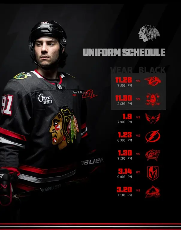
1) Blackhawks red
2) Blues 2000-2025 white (the white makes the Blue Note look best)
3) Blues 2000-2025 blue (I FAR prefer the two-tone blue/navy over the current retro monocolor)
4) Canadiens red
5) Sharks original home teal
6) Rangers traditional home blue (not any of their 3rds)
7) Last Whalers (circa 1996) white
9) Blues current retro white (I do prefer the slimmer current Blue Note over the ones the last few years)
10) Red Wings white (mainly for the fantastic logo — the uniform is a bit boring otherwise, especially the home all-red).
Favorite logos:
Blackhawks head (and the C with crossed tomahawks on shoulders)
The current (which is also the 1967-1980) Blue Note and the one just previous (2000-2025)
Note: I hated the small Blue Note with the large BLUES over the top and wasn’t fond of the one with the small St. Louis tacked into it.
Red Wings Winged Wheel
The North Stars N
Atlanta Flames
Whalers
Kings original crown (rounded) and Kings circa 2000 crown (pointed). I don’t like any of the Kings “shields” logos. I want more crown!
Sharks
Avalanche

