shootsnscores wrote: ↑24 Jun 2025 09:34 am
Not a fan of the lighter blue color. The new ones look cheap.
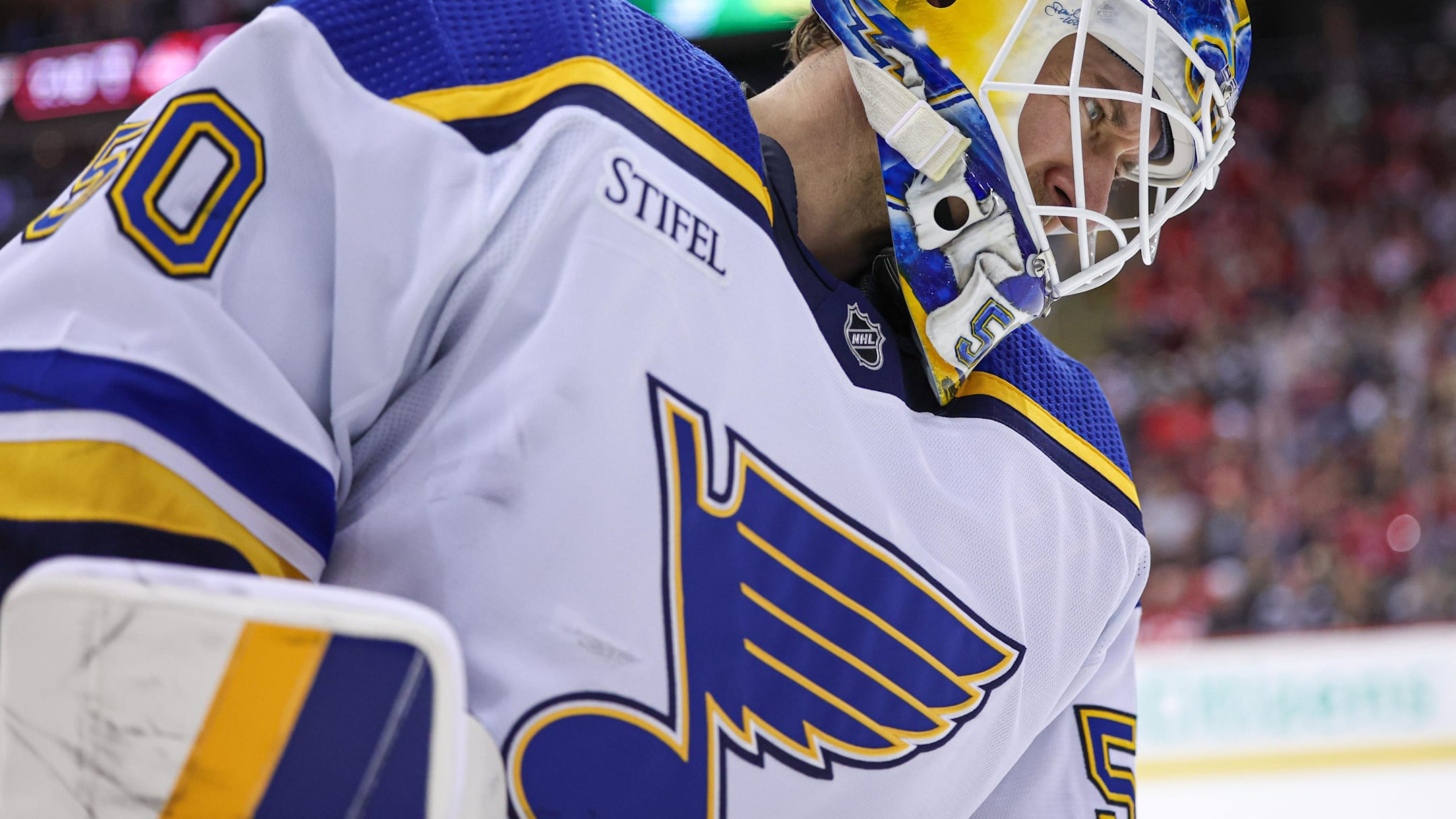
Give me the Darker Blue on white every day
I'd be good with that blue as well.
That Blue never looked good to me. It made our players looked like lawyers and businessmen. This color makes them look like glorious triumpant hockey players. All that our players need to do now is loose some teeth to go with it.
Royal Blue looks great to me. It makes them look like champions.
somni wrote: ↑24 Jun 2025 10:50 am
I like them, especially the white jersey. I'm not as old school as some of you But I wish they'd go back to wearing whites as their home jersey like they did in the 80s and 90s.
Oh, and I really want a late 80's or early 90's jersey as a 3rd sometime. Heck, I don't even mind the little "St. Louis" script that was in the note. Just loved the design and reminds me of the Brian Sutter days.
KarmaFTMFW wrote: ↑24 Jun 2025 09:50 am
What sucks though is we’re just one day closer to the day he gets fired. Just like with Chief. I wish the NHL wasn’t such a revolving door for coaches.
Enjoy it (him) while we can. He may wind up becoming the longest tenured Blues coach in history. And I'm excited for what's coming ahead !
I hope he is, but another playoff run or two sabotaged by a glaring season-long problem (6-on-5) will bring the calls for a neck-tie party.
KarmaFTMFW wrote: ↑24 Jun 2025 09:27 am
Are these an alternate or the main home and away sweater?
Main home and away. I think the 90s and the yellows will be the alternates for the foreseeable future.
I believe the home jerseys they've been wearing the last few years is the new alternate.
Yep just saw that.
Doesn't make sense to me, but ok then.
Well they just launched the new home and away jersey's, They're going to sell a seasons worth of those, and blow through the existing inventory of the current jersey's before relaunching a new 3rd next year (hopefully) as mentioned earier, I'd be good with the Oshie Navy 3rds with the laces.
In a way, the new thirds (the prior home jerseys) are a way to honor the 2019 cup team. But yes they will probably have a new third next year.
bixblues wrote: ↑24 Jun 2025 10:52 am
I guess i'm in the minority here but I like the #'s without the outline.........think it's more old school looking.
It's definitely a simpler look without the outlines. I'm getting used to the logo that way. Something about the numbers just feels incomplete. But I'm sure within a few games I'll be fine with it.
I like the outlines on the numbers and logo better... but if they did that, it would basically be the exact same as the 3rd and not give anyone a reason to buy a new one.
That's the reason they didn't add the outlines... they needed any excuse they could come up with to call it "new"
It's a big miss. Most fans love the new look, but thousands of criticisms of the numbers. It's all over Twitter too.
I imagine over the next few years, they'll fix it, but it won't be until they've sucked this lemon dry.
Yeah that was/is my main thought for why they decided to do no outlines for the numbers. That and the very slightly altered note compared to the 17 and 22 WC Blue Notes would be enough change for a good chunk of fans to buy the New Jerseys. I already have a 17+22 style WC jersey and I don’t plan on getting any of these new ones.
That being said, love what they went with! My favorite white jersey by far and a big fan of the power blue and gold.
I'm pretty excited about the change too.
Wayne Gretzky said growing up in Canada, when the Blues came into the league, they were the most popular among the Toronto kids because of how cool the logo and uniform was. Unfortunately, it didn't take them long to destroy that look.
They've had an unnecessary identity crisis for 40-50 years. Yokes or no Yokes. "St. Louis" script in the bluenote or not. Red or Navy Blue? When the entire time, they should have just kept the original look (with modern adjustments) the entire time.
I feel the same about the San Jose Sharks. Nothing beats their original 1990s look.
The Blue note on the home blue jerseys needs a white outline. It looks bland and cheap without it and may not even show up at a distance. The whites look great.
DIAMONDINTHEROUGH wrote: ↑24 Jun 2025 10:37 am
So 3 newer logos. Yet only one of them in on the uniform. And it's relegated to the pants.
Where else would you place that STL treble clef (my favorite if the 3) other than the pants?
Just curious, nothing more.
It's fine there. But I like the trumpet more. And putting it on the front or the shoulders would have been my preference. I would rather incorporate a fresh new look than keep regurgitating the same old stuff we've seen for years. And that trumpet would have been a bold and welcome change.
shootsnscores wrote: ↑24 Jun 2025 09:34 am
Not a fan of the lighter blue color. The new ones look cheap.
Give me the Darker Blue on white every day
I'd be good with that blue as well.
That Blue never looked good to me. It made our players looked like lawyers and businessmen. This color makes them look like glorious triumpant hockey players. All that our players need to do now is loose some teeth to go with it.
Royal Blue looks great to me. It makes them look like champions.